
The Bellyflop | Brand & Collateral Design


A podcast created by two lifelong friends to reminisce on their college days and explore (sometimes rant) about life as it currently is while always maintaining a flare for finding humor in the mundane. This brand is all about having fun, living carefree and rolling with the punches of adulting. A custom “bellyflopper’ illustration was created to use as the primary mark for the brand and colors were sourced from the early 90’s, reminiscent of the podcast creators childhood.
Modern Koi Pond | Surface Design Collection


A whimsical, hand drawn collection with a modern spin inspired by the natural elements found in a traditional Japanese koi pond. Each pattern is unique but the playful style, repeated elements and colorways pulls the collection together in a way that makes it well suited to design a suite of products. The entire collection conveys a gentle sense of calming, fluid motion making it a perfect fit for a children’s line. I also see this working well for a light-hearted women’s product or as a statement wallpaper in rooms looking to pull in elements of water and create a calming vibe. Contact me for further details on licensing this collection.
PLANTiful Lunch Box Ideas | Printed Cards with Custom Illustrations


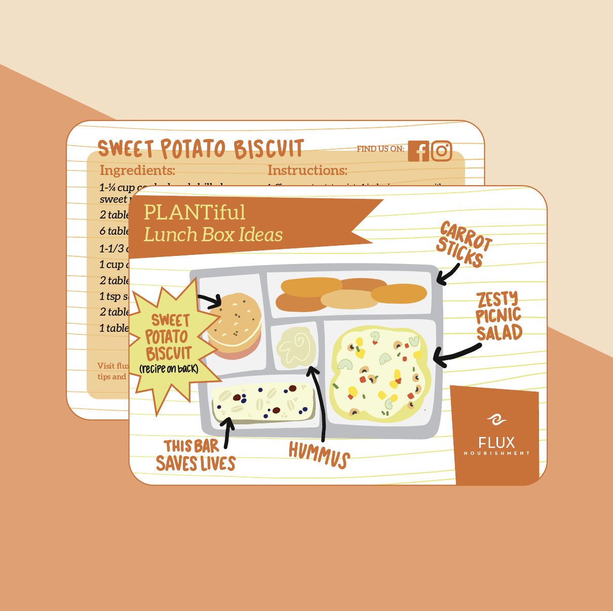


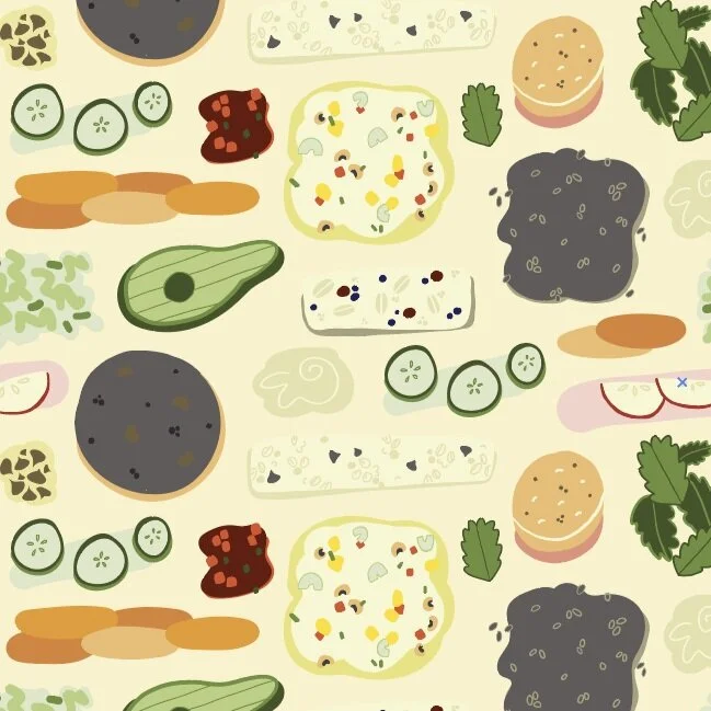
This client requested a design for their children’s brand that would appeal to moms and their young children while making plant based eating look attainable, appealing and fun. The custom illustrations align with three different suggestions for packing plant based lunches and the backside of each card contains a recipe for one of the items on the front. The style of the illustrations remains consistent throughout the cards. Hand lettering, a hand drawn stripe and a saturated color palette were used to ensure there was a sense of cohesion across all three cards. A repeating pattern was created with the food illustrations and could be applied in a variety of ways to further the children’s segment of the brand.
University of Chapel Hill Icon Silk Scarf | Custom Illustration + Repeating Pattern


For this collaboration I was asked to create an original design for a the launch of a women’s scarf line at a high-end store specializing in college ties and pocket squares. The aesthetic of their existing product was masculine, symmetrical and bold. After a lot of sketching and product ideation with my client, we decided to break from their existing aesthetic with a hand drawn icon scarf. The final solution incorporated a variety of iconic campus architecture as well as nod to their winning sports culture and the tarheel state. The different elements were united by an asymmetrical placement of abstracted dogwood florals. We worked with the university to receive artwork approval so that the end product could be marketing as a University of North Carolina at Chapel Hill product.
SHARE GOOD Identity | Collateral Design with Custom Illustration


SHARE GOOD Software is the Saas company behind an online giving platform for nonprofits. When SHARE GOOD approached me they had a strong brand identity for their client software (visit Share Charlotte to view) but were lacking their own personality as the parent brand. They wanted their parent brand to stand out from other they’d seen in the Saas industry and to maintain some connection to their software identity while having their own unique look and feel. The solution was to keep their software identity color palette and create an eye catching illustrations for their hero image and various elements that could be infused throughout their print and web collateral. Additional projects included 40+ page implementation booklet for Share software users, google slides template, website consultation, web asset design and style guide.